Political Donor Research | NGP VAN

Building a donor list is one of the more challenging ongoing tasks that any campaign has to work on. Attempting to solicit every voter in your district for donations is not practical, nor is it an efficient use of your campaign’s resources. In fact, even voters who are dedicated to your campaign or cause may not always be the best fundraising targets due to a variety of reasons. Even with a number of ways to solicit donations, like call time, emails, and mobile messaging, it can be difficult to identify potential donors or, when you do identify them, the right amount to ask for.
Fortunately, modern campaigning software has revolutionized the fundraising process, allowing campaigns to identify and communicate with different groups of donors through various channels. Discover how to take advantage of these tools in your political donor research to evaluate prospective supporters, focus your resources, and make successful fundraising requests.
What is Political Donor Research?
Political donor research is the act of searching for information on specific prospective or existing donors to provide context to make a more informed fundraising ask in the future.
Effective research explores both a donor’s capacity and probability to give to your campaign. These factors are evaluated by researching supporters’ wealth markers, such as stock holdings and real estate investments, and affinity markers, such as past contributions to nonprofits or other political candidates with similar values to yours (while following relevant laws and guidelines related to soliciting political donations).
Political Donor Reports and Tools
Public records of past political donations are a useful tool for discovering specific donors’ past giving amounts. However, you cannot use individual contributors’ data from FEC reports to solicit contributions as that is strictly prohibited under the Federal Election Campaign Act. Some campaigns “salt” their lists with a few fictitious names at real addresses to monitor if their reports are being used illegally. Steep fines and criminal charges may result if a violation occurs.
State and local election laws may differ, so if you don’t know if you can use state and local campaign finance reports for campaign purposes, reach out to your relevant election authority to check before you use them. Regardless, these reports and databases only provide limited insight into what a donor might be willing to give to your specific campaign. This is where more detailed, politically-oriented donor research tools come in, like two essential features of NGP: Donor Target Scores and Donor Target Reports.
Donor Target Scores
Developed by our best-in-class fundraising team, Donor Target Scores utilize predictive analytics to match your existing contacts to our nationwide warehouse of tens of millions of donors and provide custom scores that model a contact’s giving likelihood and capacity.
After uploading your contacts into NGP, every contact in your database will have two scores: Likely to Donate and Giving Potential.
The first score tells you the likelihood of that person donating and the second predicts the person’s capacity to contribute. These scores are divided into four categories: Top 10%, Next Top 30%, Middle 40%, and Bottom 20%, which are then customized for your specific campaign or committee. Many donors may give a small donation first, so these categories can help you better understand the true giving potential of your prospective and existing donors and save your campaign valuable time during the busy election cycle.
Donor Target Scores are developed using proprietary algorithms based on aggregated and anonymized datasets derived from across the NGP universe. Since privacy is always a top concern, no names, contact information, or donation information will be shared as part of the score. Data derived from the FEC is not used as part of the score development.
Donor Target Reports
Along with Donor Target Scores, you can make your call time and fundraising programs more efficient and user-friendly with Donor Target Reports.
Donor Target Reports help you act on Donor Target Scores by providing several pre-segmented reports:
- Prospects Targets Report: Identifies potential donors who have not given to your campaign.
- This Cycle Resolicit Report: Identifies donors that have given this cycle and can legally give more.
- Last Cycle Resolicit Report: Identifies donors that gave last cycle but have not yet given this cycle.
These three new reports and many of our most used reports can be sent directly to your candidate’s or fundraiser’s list, allowing fundraisers to take immediate action on identified prospects, such as directly sending them to call time, adding them to an event-building universe, or texting them.
Suggested Fundraising Effort
Each Donor Target Report considers a contact’s Likely to Donate and Giving Potential scores to calculate a Suggested Fundraising Effort.
Suggested Fundraising Effort is marked in categories from “$,” indicating a low likelihood of donating and low capacity to give, to “$$$$,” indicating a high likelihood of donating and high capacity to give. With this at-a-glance metric, fundraisers who have limited time available for donor research and short timelines for raising money can quickly determine how best to allocate their resources for fundraising.
For example, contacts with a high Suggested Fundraising Effort are strong prospects for early outreach and should be added to your candidate’s call time list or invited to attend fundraising events. Contacts with lower Suggested Fundraising Effort ratings might call for less personalized outreach, like an email solicitation or an invitation to a grassroots catch-all fundraiser.
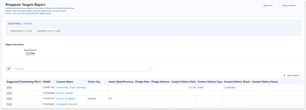
By using the Suggested Fundraising Effort, campaigns can quickly segment supporters based on their giving potential and plan different outreach methods to efficiently raise money for the campaign.
All these features are available within NGP, the industry’s leading fundraising and compliance solution for campaigns and causes. Within NGP, you can create comprehensive donor profiles and extensive automated and complex communication campaigns through features like Targeted Email and Mobile Messaging, track your fundraising progress, and so much more in a centralized donor database. As you begin reaching out to donors, you’ll want a database like NGP to consolidate and track as much information as possible to make your future outreach even more effective.
Identifying & Contacting Prospective Political Donors
Predictive analytics are essential for organizing donors at scale, but after you group donors by their Suggested Fundraising Effort, it can sometimes take a human touch to turn that potential giving into fundraising dollars.
Here’s a quick breakdown of how to assess prospective donors, manage relationships with them, and grow your giving network.
Contacting & Qualifying Prospects
While the quantifiable data may point to a supporter being a potential donor, the only way to know for sure is to contact them and ask them to give. While you may not have the time to call every potential donor on your list, you can prioritize and segment outreach based on their Suggested Fundraising Effort within NGP. This will allow you to contact donors who are likely to give in the beginning of your outreach and hopefully lead to an influx of donations for your campaign.
Some campaigns with a fundraising team may have their staff contact prospects in advance to qualify them and schedule a call with their candidate. Other campaigns may have candidates contact these donors directly. During these calls, the caller will want to ask the prospect questions to get to know them, understand their values and interests, and gain a sense of their political priorities.
Your campaign will tailor questions around your community and your candidate’s policies, but a few general questions the caller might ask include:
- What motivated a donor to make their first donation (if one has been made)?
- What would they consider their top political giving priorities?
- Do they have any specific hopes for the future direction of the community?
Additionally, the caller may add personal questions into the mix to form a more natural relationship and build a connection with the prospective donor. For example, they might ask about their hobbies and interests or even upcoming vacation plans. The ultimate goal of this process is to build a relationship with the donor, discover their values, and qualify their likelihood for donating in the near future.
During the qualification process, some donors may show great interest in forming a personal relationship with your candidate, whereas others may make it clear they would prefer to only give modest contributions and not be pursued for additional donations. Either way, gathering and saving this information will allow your campaign to focus your time and resources on the right donors in the future.
Segmenting & Tracking Prospects
Your relationships with donors should ideally span campaign cycles, providing your candidate with reliable fundraising revenue when it’s time to run again. You can maintain relationships with donors that last multiple years with dedicated prospect segmenting and tracking.
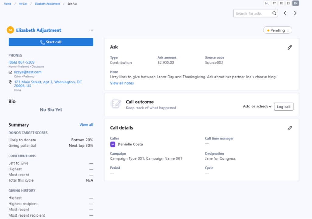
For each donor you intend to cultivate a relationship with, keep a dedicated profile on them that details their personal information, past giving history or pledges, and notes about past interactions that might influence how you approach your next meeting. These profiles can help you make more personal connections with donors, and they can be especially helpful for maintaining consistent communication in the event that your campaign experiences turnover or brings on new fundraisers between election cycles.
As you gather and input more data into these donor profiles, you will likely want to segment that data into different groups so you can reach out to them through various channels with relevant messages. For instance, if someone has already given to your campaign, you can thank them for their support so far and ask for another donation compared to encouraging a donor to give for the first time.
Network-Building
Along with contributing to your campaign themselves, your political donors can often be one of your best resources for finding new donors. After all, one donor who is interested in giving often knows several other prospective supporters with similar political values and financial resources.
Even if a donor has a strong affinity for your campaign, cold outreach is still difficult. Fortunately, some of your donors may be willing to help with this part of the process by facilitating introductions to other potential supporters. These new donors are far more likely to be receptive to conversations about your campaign if you’re backed by a trusted friend or colleague of theirs.
Manage your relationship network in your donor database by noting your supporters’ political, business, and familial connections, as well as any other information about their relationships they may share with you. And above all, keep building positive relationships with donors to ensure they are engaged and feel like their support is appreciated.
Attracting New Online Donors
Your website will likely be one of the first places potential supporters and donors find more information about your campaign. It’s critical to have an engaging and easy-to-navigate website that provides a great first impression and includes calls to action to donate, volunteer, and more.
You can make a positive first impression on these donors by:
Capturing Visitors’ Attention with Quick Load Times
Visitors expect websites to load in two seconds or less. While you can’t control everything that impacts loading speed, you can optimize your page to make sure that it doesn’t slow you down.
Generally speaking, the larger your file sizes are and the more files you have to load on a page, the longer it will take to load in the browser. By opting for a clean and simple design, you can improve your page’s loading speed and in turn, keep visitors’ attention.
Focusing Visitors’ Attention
The most important content on your websites are your calls-to-action or CTAs, asking visitors to subscribe for updates, donate, or take another action. While it can be tempting to simply follow current design trends, your website’s layout should ultimately be driven by your goals.
Your website should have a clear workflow that directs visitors’ attention to your CTAs. Feature your primary ask on your homepage and make sure that your menu highlights your donation page.
In addition to featuring your call-to-action on your homepage, every single page on your website should provide users with the opportunity to take action. Some websites include a text box at the bottom of each page that invites people to subscribe to email updates. Others include a donation ask at the bottom of each page. Whatever your CTAs are, be bold with your asks, so that your supporters know how to take action for your campaign.
Providing Next Steps
After your supporters take action, be prepared with a next step that invites them to deepen their involvement. If they sign up to volunteer, consider asking them to make a donation. If they make a contribution, consider asking them to attend your next volunteer event. However, make sure to respect supporters’ limits. Some people may only give their time to the campaign while others may just donate to the campaign. While you want to try and deepen a supporter’s relationship with the campaign, you don’t want to burn them out.
Utilizing NGP to Help Expedite Your Political Donor Research
Fundraising is a core part of the campaigning process, and NGP is the premier fundraising and compliance software to help you expedite your donor research, create comprehensive donor profiles, and prioritize data-driven donor outreach to help you raise more money for your campaign.
Explore how NGP can help you raise the funding you need to run a competitive campaign.